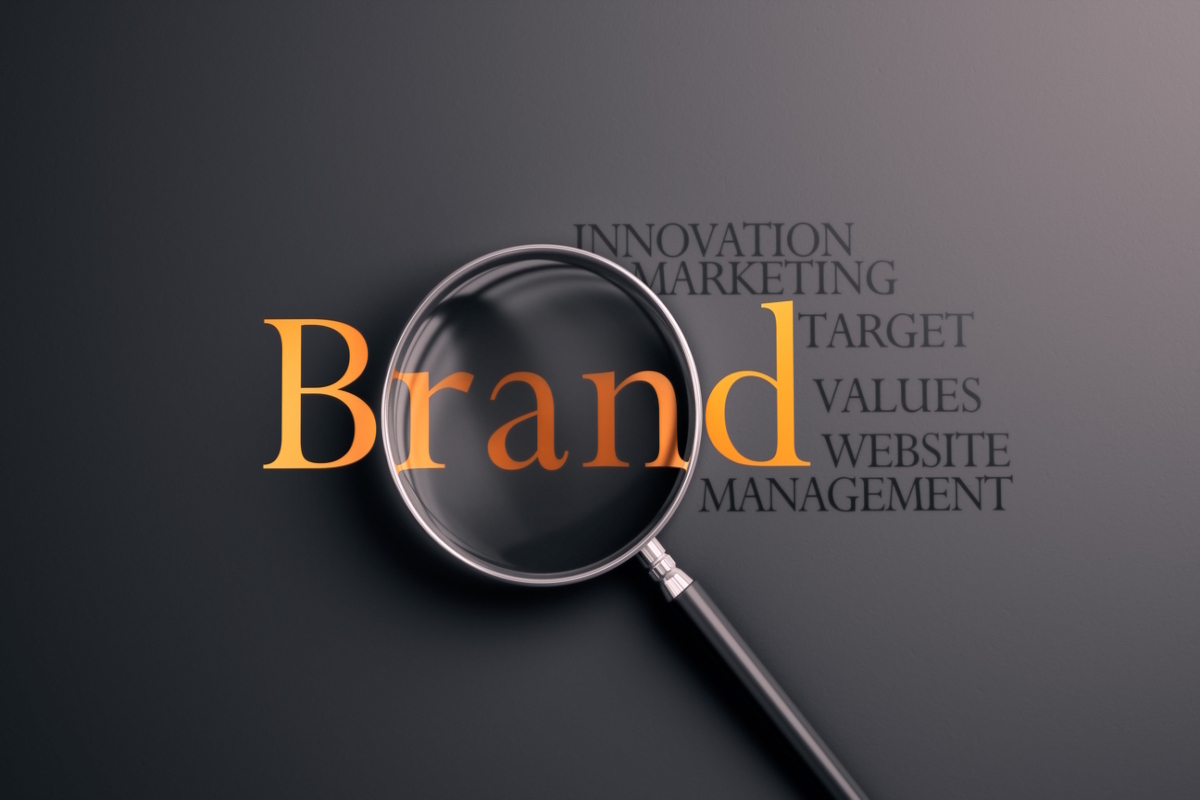
Don’t put shade on your distinctive brand assets
Alex Stewart at Derek&Eric shares some lessons from Cracker Barrel and other businesses that have eroded their brands
There aren’t many topics that unite the MAGA crowd and the global design industry, but the recent logo change at US restaurant chain Cracker Barrel managed it. A high-profile backlash followed and, for a brief moment, everyone had a view on kerning and cowboys. President Trump even joined the calls for the old logo to be restored. When the company ultimately reinstated the old logo, it prompted a blizzard of commentary about the implications for design and a social media storm.
But there is a bigger business lesson here. When distinctive brand assets are put in the shade – whether through sudden change or slow erosion – value is put at risk. In Cracker Barrel’s case, the controversy coincided with nearly $100 million being wiped from its market value.
These flare-ups grab headlines, but far more often the consequences of putting distinctive brand assets in the shade are quieter: missed baskets in the supermarket, fewer ‘automatic’ picks on a food-delivery app, and a gradual loss of price premium. It’s the erosion of what makes a brand instantly recognisable, reassuring, and bought.
That’s not inevitable. With care, distinctive assets can be refreshed to keep pace with the modern world, while holding on to the quirks and heritage that make them unique. And if they have slipped into obscurity, they can be brought back into the light. The lesson from Cracker Barrel is simple: don’t put shade on your brand assets.
Not the first
Cracker Barrel is far from the only business to have experienced this turmoil. GAP was forced to abandoned a logo redesign within a week in 2010. Tropicana famously swapped its distinctive straw-in-the-orange pack design in 2015 for something that looked a lot like supermarket own-brand. The backlash was so severe that Tropicana had to quickly revert to the original design. In 2018, Burberry dropped its knight and serif logo for the sans serif uniformity of the fashion sector, losing a powerful link to its heritage. It was then changed again in 2022. And Jaguar’s recent rebrand sparked massive debate online and in the press.
These are the dramatic examples, but the greater risk often comes, not from one-off redesigns, but from the slow and steady erosion of distinctiveness. Each decision can make sense at the time: reduce the core assets by 5% here to fit in a sales message, 3% there to make space for a campaign image, a little more to highlight a new product line. It might even deliver a short-term uplift, which makes it easier to justify the next tweak, but added together, those cuts leave the brand in the shade, harder to spot on shelf or screen, and easier to confuse with everyone else.
The habit loop breaks. And if you start to resemble a cheaper competitor, you also undermine your ability to command a premium.
How do brands end up here?
The first driver is the broader trend towards simplification. Clean, flat, digital-first design has its place, but when every brand adopts the same look it becomes harder to stand out.
Secondly, over time, those incremental choices accumulate into fragmentation. Innocent’s packaging is a good example: as the range expanded, each product variant was designed almost in isolation. The result was a shelf presence that looked more like a collection of unrelated drinks than a single strong brand block, weakening the halo effect across the portfolio. Its new rebrand a simplifies and rationalises the brand architecture and design, while bringing its key distinctive assets back to the fore.
Another issue is timidity. Organisations worry about alienating loyal customers, so they tinker around the edges rather than evolving assets with confidence. Ironically, this can leave a brand looking tired and dated. Guinness, Stella and Budweiser all went through periods where they felt like “your dad’s drink” before rediscovering the craft and heritage that made them iconic.
There’s also the opposite tendency: brands that throw everything out every few years. Often this is a symptom of deeper problems, the product itself has lost relevance, and brand redesign is being used as a sticking plaster.
Finally, marketers get bored. While a brand team sees their logo and assets every day, the average customer interacts only occasionally. What feels stale internally often still feels familiar and reassuring to the outside world.
How to fix it
The good news is that erosion is not inevitable, and even when assets have slipped into obscurity, they can be revitalised.
Burger King’s 2021 refresh deliberately returned to the logo style people still remembered from the 1970s and 80s. Research can reveal that consumers have a stronger connection to an earlier iteration of the brand assets. So, Burger King used their history to produce a design that felt both modern and instantly familiar.
For Guinness, successive redesigns didn’t reinvent the wheel, but elevated what was already there. By enlarging and crafting the harp, it leant into the brand’s history of illustration and detail.
So, how can other businesses follow suit?
Identify what your best brand assets really are. Don’t assume. Research what customers actually recognise and care about, not what you wish they did. The “straw in the orange” was Tropicana’s true cue; in the case of Cracker Barrel, it turns out it was the seated man leaning on the barrel.
Look back to move forward. Ask when your brand was at its most iconic and why. Sometimes the most powerful refresh comes from the archive. It’s not necessarily nostalgia for its own sake, but because those quirks often still hold meaning today.
Create flexible systems. A strong brand identity should make it easier, not harder, to launch the next campaign or product. Consistency doesn’t have to mean rigidity, but it does mean having a clear hierarchy and principles to stop the core from being diluted.
Keep your soul intact. Modernise without while keeping the ‘grit in the eye’: the quirks and imperfections that make a brand distinctive, the things people would never design if they started from scratch today. Maybe it’s an odd curve in the typography, or a logo drawn decades ago by a founder or illustrator with a very particular style. These unusual details give heritage brands a human quality and depth that can’t be replicated. They are easy to over-sanitise with modern tools, but they’re often what people instinctively connect with and remember.
Left untouched, distinctive assets can quickly start to feel old-fashioned. Over-sanitised, they lose the quirks and grit that make them memorable. And stripped away completely, they risk breaking the bonds that hold customers to your brand.
The Cracker Barrel episode is a reminder that, whether through sudden shocks or slow erosion, allowing your assets to fall into the shade carries a real business cost. So, know what makes you recognisable and update it with care.
Alex Stewart is Co-Founder and Creative Partner at Derek&Eric
Main image courtesy of iStockPhoto.com and spawns

Business Reporter Team


Most Viewed
Winston House, 3rd Floor, Units 306-309, 2-4 Dollis Park, London, N3 1HF
23-29 Hendon Lane, London, N3 1RT
020 8349 4363
© 2025, Lyonsdown Limited. Business Reporter® is a registered trademark of Lyonsdown Ltd. VAT registration number: 830519543